|
|
|
|
|
|
|
|
|
|
|
|
|
Establishing Lean Metrics – A Quick Start to your Data
Based Reporting System
Click
here for PDF version
|
|
|
Strategic Foundation
In my previous white paper, “Establishing Lean
Metrics – Using the Four Panel Approach as a Foundation for a Lean
Scorecard”, I outlined the essential steps required to establish a data
based reporting system. It is necessary to systematically define the categories
for measurement, and then develop a vision statement, objectives, measures, and
strategy for each category.
While establishing these foundational steps will dramatically increase the
effectiveness of a metrics system, additional tools are needed in order to make
the system functional. The system relies on charts and graphs to communicate
issues. It relies on discipline from management and staff to effectively drive
continuous improvement. The essentials of putting this visual reporting and
management system in place are outlined in the following pages.
Metrics Reporting System
One of the outputs from the Four Panel work sessions is a list of measures. But
each of the measures needs a reporting system, i.e. set of charts, that includes
these four elements;
- Demonstrate performance changes over time and compare performance to
targets (Trend Chart)
- Illustrate clearly the current issues and their relative severity
(Pareto Chart)
- Show historical trends of issues and the relative severity of past issues
(Paynter Matrix)
- Record actions that have been taken and report the effectiveness of those
actions. (Action Log)
These requirements can be easily satisfied via a single, one page report. A
simple Excel spreadsheet allows for tracking and charting the data with relative
ease. A sample of the finished product is shown, each of the measures will
require a sheet with these four charts. I have developed a template for this
which you can download here.
To make charts more powerful and easier to use, make sure to clearly label the
charts and the units used, and avoid complex formulas or transformation of the
data; stick with the data in the form most likely to be understood by
everyone.
|
|
|
|
|
|
|
|
|
|
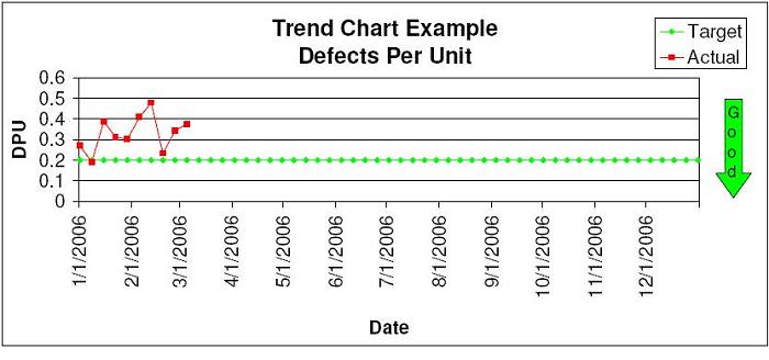
Trend Charts
Sometimes known as run charts, trend charts are used to show changes in
performance over time. Run charts are used to provide a visual indicator of
performance. Since there will always be some variation in results, displaying
them over time makes it easier to see and understand how our actions are changing
the results, and how we are performing relative to the target.
Resist the temptation to set the time periods too short for the individual data
points on the trend chart. Short time periods can make it difficult to see the
real trends. Occasionally, it is acceptable to use time periods as short as one
week, but generally monthly buckets are preferred.
When setting up trend charts, be sure to include and clearly label the targeted
performance. Place an arrow labeled “GOOD” and indicate the direction the results
are desired to move.
To make your trend charts the best they can be, make sure to follow these
guidelines.
- Label the chart with a brief, but descriptive title.
- Label the Y Axis with the units being used. Label the X Axis with the time
periods.
- Don’t crowd the data to the top or the bottom. Use most of the range
available, but allow for future movement. Don’t include impossible numbers.
(i.e. 110% On-Time Delivery)
- Don’t change the scale of the chart once established. These same reports
will be used month after month. Changing scales tends to confuse and make
interpretations more difficult.
- Use one chart per measure. Don’t add extraneous data or try to combine
related measures on a single chart.
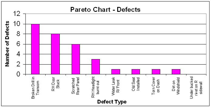
Pareto Charts
A Pareto chart is a special form of a bar chart that puts items in order from
highest to lowest (occurrence, time, cost, etc.). It is the visual manifestation
of the Pareto Principle which states that when several factors effect a
situation, 20% of factors will account for 80% of the issues.
Pareto charts are valuable because they help us to quickly identify the vital few
factors on which to focus in order to maximize our overall results. They break
big problems into smaller pieces and help direct our limited resources.
Pareto charts always present the data from highest to lowest. If a bar chart
doesn’t present the data in this format, then it isn’t a Pareto chart. The data
on which Pareto charts are built can usually be categorized in multiple ways. For
example, should the quality data be sorted by number of occurrences, by total
cost, or by its impact on the customer? Chose carefully, the way you decide will
impact the actions which will be taken down the road.
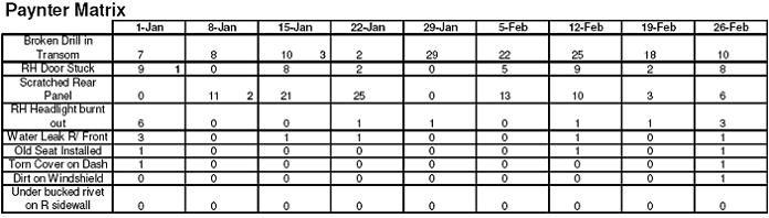
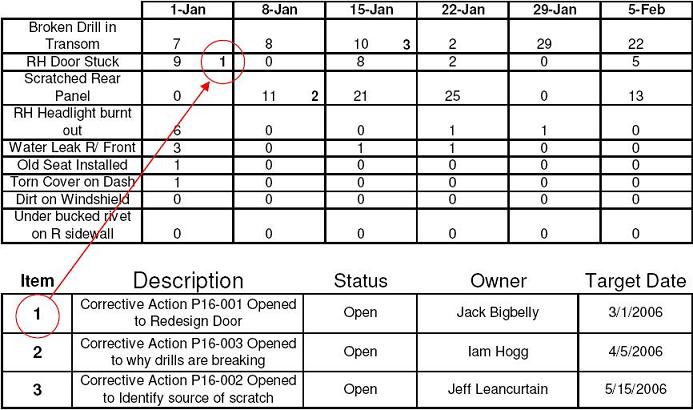
Paynter Matrix
The Paynter Matrix is a tool which illustrates the effectiveness of containment
and corrective actions. It allows us to track the cumulative effect of corrective
actions on the results. It actually uses the same data as the Pareto charts, but
adds a time element by showing the data for previous time periods.
It is essentially a matrix with categories in the leftmost column with a time
series in the succeeding columns. When corrective actions are implemented for a
particular category, the action is noted on the time series. When the corrective
action is effective, there will be a corresponding improvement in the
results.
|
|
|
|
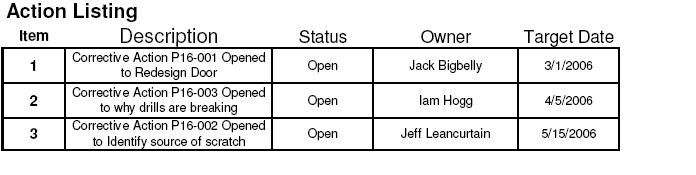
Action Log
The action log is a tool for recording and tracking required actions. It provides
clarity for what is to be done, a mechanism to conduct regular review of the
actions and their status, defines the responsibility for the actions and provides
a date certain for completion. The action log is the tool that connects the
metrics system to the continuous improvement process.
Establishing Discipline and Conducting Reviews
The data based reporting systems are of no use if we don’t follow through and
establish the discipline to use them. In my visits to plants, it is common to
find measurement systems that have been abandoned; the charts are posted on the
bulletin boards, but the data is out of date. It just serves as a reminder of
another failed attempt at improving our operations.
Establishing the foundation and the charts for a measurement system is fairly
easy. Most companies and experienced managers can define the vision, objectives,
measurements, and strategy in a few days. Within a couple of weeks, the charts
and spreadsheets can be set up and put in place. But this effort is valueless if
the tools aren’t used once deployed.
If you want your measurement system to beat the trends and really become a tool
that drives improvement, here are some tips for making your data based reporting
system more successful:
- Get buy-in from facility managers while developing the system. Don’t
develop it in a vacuum and force it down their throats. Involvement in the
process is the key to success.
- Follow up. This is important. Travel to the manufacturing facilities and
review the results face-to-face. Don’t fall into the trap of just following up
by telephone, or even worse - just reviewing reports submitted by e-mail.
Visiting the plant to review the results will emphasize their importance and
will dramatically improve results.
- Hold the operations team accountable for the results. Performance on the
metrics should be reflected in bonuses, performance reviews or other
performance based rewards. However, this only works when there is buy-in from
the facility team on the performance targets. They cannot be held accountable
(or rewarded) for performance on metrics which are not achievable or those that
are not in their direct control.
- Make the metrics clear and easy to understand. Clear definition of exactly
what data to collect and how to calculate results will help prevent
manipulation. When employees can see how their individual actions improve the
results, they will respond in a positive manner.
- Insist that local management include first line supervisors and hourly
associates in the reviews. The more they understand the measures and why they
are important, the sooner improvement will be realized. Hourly associates
should regularly be asked to present the results and the action steps to the
management team – it can help break down barriers and establish open
communications.
- Always demand action plans, improvement teams, workcell kaizens, or other
proven problem resolution methodologies be employed to resolve issues once
identified. This system can help drive improvements in your facility, but only
if you use it as a tool to drive continuous improvement.
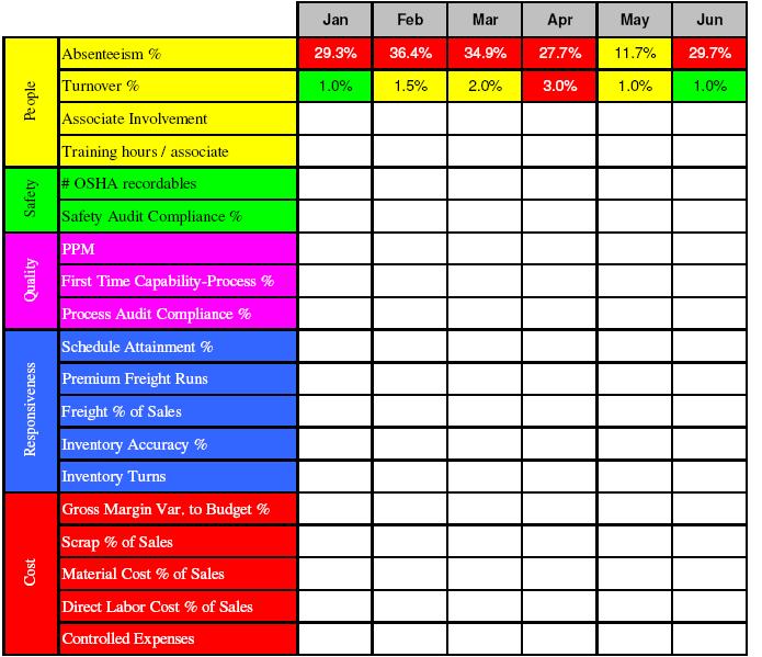
Use a Scorecard to Summarize and Report to Management
It isn’t uncommon for these systems to have 20 to 25 individual measures. In
order to see trends that may occur between the measures, and to rapidly report
facility results to executive teams, it is necessary to consolidate the results
on a single report; commonly referred to as a scorecard.
The data for the scorecard comes directly from the trend chart. The monthly
results from the trend chart are inserted into the appropriate cells in the
scorecard and color coded; green - results are on track for the month and for the
year; yellow – results are on track for the month, but not for the year; red –
the results are not on track for the month or for the year.
|
|
|
|
The entire system is very visual. The trend charts and the Pareto charts display
results in a visual format. This visual orientation continues with the scorecard.
In addition to color coding of the results, the categories themselves are color
coded.
- People – yellow
- Safety – green
- Quality – purple
- Responsiveness – blue
- Cost / Finance – red
These tools, combined with the discipline required to use them, the proper
application of lean manufacturing techniques, problem solving methodologies, and
mistake proofing methodologies can greatly increase the velocity of change within
your operations. It isn’t magic, it requires much work and a willingness to
change, but the results can be spectacular.
|
View site map

|
|